For example, this beautifully illustrated book in Arabic script:
What is it? It's a copy of the Four Gospels, written in Arabic for Arabic Christians. (There was also an example of an Arabic language text, written in Hebrew script.)
Mosque lamps:
Or these limestone capitals made for a Crusader constructed church in Nazareth:
A Persian representation of the prophet Muhammad before the Angel with 70 heads:
And over-the-top riches, the Chasse of Ambazac:
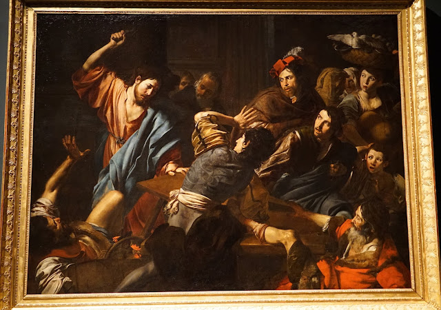
Also at the Met is a show of paintings by the French painter Valentin de Boulogne, who worked in Italy and was a follower of Caravaggio. It's a "blockbuster" show, featuring 45 of the 60 known paintings of Valentin, except, of course, that nobody has ever heard of him. The show is spectacular, and indeed demonstrates that we should have heard of him. And the paintings are the real thing: dramatic and visually compelling. One whole room was nothing but paintings of music being performed. Here are a few highlights:
And some details:
We also saw the Agnes Martin retrospective at the Guggenheim. It was simply one of the best shows I have seen in years. Her work gains in meaning when you see it in the context of her career, and seeing many of her works makes you appreciate the rigor of her painting. Martin comes from the generation that believed in the possibilities of non-representational painting to convey profound human emotions. She came out of the tradition of abstract expressionism, but her works convey a profound and more meditative meaning. (We saw the exhibit on the day Pauline Oliveros's death was announced; I was struck by some of the similarities of their artistic goals.) She also has something in common with Mark Rothko, except that her favorite color is grey or white, and her palette is distinctly muted. Her best work to my eyes is the work she created when she settled on the standard of a 72 inch square canvas. Looking at these canvases, all kinds of subtle and shimmering colors and patterns gradual emerge. It's work that you would really want to live with. As I write this, I feel the urge to go back and see them again.
It was a well put together show, but I did have some quibbles. When you have paintings that are mostly white and delicate shades, the light around them makes a great deal of difference in what you see. (Anyone who has ever tried to pick a shade of white paint by looking at paint store chips will agree with that.) The Guggenheim lighting certainly casts its own colors on the works; I would have loved to see them in a purely natural light (outdoors!), or in an environment like the new Whitney Museum. My second quibble has to do with the nature of the walls in the Guggenheim; in general you are kept about six feet away from the works by the sloped area in front of the walls. Part of the pleasure of viewing a Martin work comes from the way the work looks differently depending on your distance from it. When you are very close (as is the case with Martin paintings in other museums), you can see the extraordinary intricate detail with which she worked. All of this is not apparent when you are restricted to viewing the works from 6 feet away.
It is wonderful to see this work in which the art of painting is so profoundly explored. Especially in the context of today's art world, where ideology trumps painting, and the notion of dedication to craft is dismissed.
You can't really properly photograph a Martin painting, but in any case, here are a few examples to give some idea (The lighting plays havoc with my cameras rendering of white):
Installation view:
Large view partial (you really need to click on these to enlarge them to see anything):
Detail of above:
Smaller, earlier works:
Several typical 72 inch square paintings:
Agnes Martin goes bling? This atypical work is made with gold leaf:
View across the Guggenheim:


No comments:
Post a Comment